Brand system · Version 1.0
An identity
with gravity.

Space. Curvature. Precision.
A quiet visual field, shaped by a clear point of focus. Gravity is expressed through proportion, curved geometry and the space around every element.
Less spectacle. More presence.
01 / Logo
Keep the orbit intact.
The supplied mark is the source of truth. Its asymmetric rings, delicate wordmark and registered symbol form one complete lockup.

Primary color · Original supplied PNG on white. Use where the cyan-to-indigo orbit can be reproduced faithfully.
Monochrome · White on Void. Use for dark applications, small digital placements and restrained editorial layouts.
Let x equal the diameter of the small orbit circle. Keep at least ½x clear on every side of the visible lockup.
Minimum digital width of the complete visible lockup.
Minimum print width. Check fine strokes at final size.
Use the provided lockup at its original proportions. Keep the registered symbol. Avoid redrawing, stretching, rotating, adding effects or separating the symbol from the wordmark.
Asset note · The original SVG depends on font ligatures. Use the supplied PNGs or browser-safe SVG wrappers for reliable display. The wrappers embed unchanged source pixels; they are not outlined vector artwork.
02 / Palette
A field of quiet contrast.
Deep neutrals create the atmosphere. Mist carries the message. Cyan and indigo introduce measured points of energy.
Void
#080B10
Primary canvas
Field
#101720
Surface / depth
Mist
#EDF2F4
Text / light canvas
Muted
#A7B3C0
Secondary text
Tidal cyan
#73C9D1
Focus / accent
Orbital indigo
#3C4784
Brand depth
Give the neutrals room.
Aim for roughly 80% deep neutrals, 15% Mist and 5% accents in dark compositions. This is a visual balance, not a strict quota. Use cyan for links, focus states and one meaningful detail at a time.
80 / 15 / 5 — indicative balance
Keep gradients low contrast and atmospheric. Use the original color logo on white rather than applying a new gradient to the wordmark.
Readable pairings.
All listed solid-color pairings exceed WCAG AA text contrast. Tidal cyan on Mist is 1.69:1: reserve that combination for decoration. Recheck opacity, gradients and imagery.
03 / Typography & layout
Precision, with breathing room.
Inter gives the system a consistent voice. Light headings create scale; regular body text keeps longer reading comfortable.
Inter / Light 300
Gravity.
Display 48–112 px · Line height 1.05
Inter / Light 300
Space creates focus.
Section 40 px · Tracking −0.045 em
Inter / Regular 400
Clear language, deliberate pacing and generous space make each idea easier to understand.
Body 16 px · Line height 1.6
System monospace / 11 px / Tracking +0.12 em
Build on an 8 px rhythm.
12 columns on wide screens; 4 on mobile. Use 24 px gaps, at least 24 px outer margins, and a maximum content width of 1440 px.
| Display | 48–112 px / 300 |
| Page title | 64 px / 300 |
| Section title | 40 px / 300 |
| Subheading | 24 px / 300 |
| Body | 16 px / 400 |
| Caption / Metadata | 12 px / 11 px |
Use 48–96 px between major sections. Keep body lines around 45–75 characters. Reduce display sizes on mobile and allow text to reflow at 200% zoom.
04 / The visual field
Let geometry do the work.
Curved fields and subtle orbit lines suggest force, connection and scale. The imagery supports the message through atmosphere and structure.
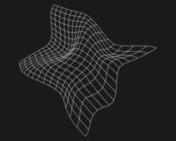 REFERENCE / CURVED FIELD
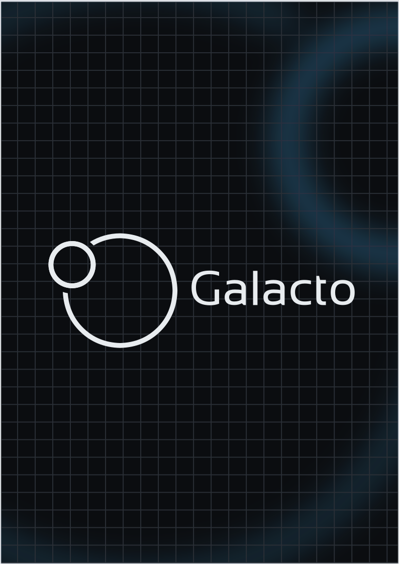 REFERENCE / RESTRAINED DEPTH
One focal point.
Crop around a single curvature, orbit or point of tension. Leave the copy area quiet and protect the logo’s clear space.
Fine, deliberate lines.
Use 1 px wireframes at 10–25% opacity. Favor curved surfaces and partial rings. Keep line density low near text.
Depth over spectacle.
Keep cyan and indigo glows soft. Avoid dense star fields, literal planets, bright lens flares and noisy visual effects.
Motion should feel inevitable.
Use 180 ms for interactions and 500 ms for subtle reveals, with no more than 12 px travel. Optional ambient drift can run over 30 seconds. Avoid scroll trapping, fast parallax and bouncing elements.
A complete still state.
Honor prefers-reduced-motion: disable ambient movement and animated reveals, show all content immediately, and preserve the intended composition. Movement should never carry essential meaning.
Easing / cubic-bezier(0.22, 1, 0.36, 1)
05 / Voice & delivery
Clear words. Lasting presence.
Sound assured, curious and precise. Use gravity as a visual idea; let factual content stand on its own.
Write with intention.
Name the subject, explain the action and give the reader a useful next step. Prefer concrete nouns and active verbs.
Use short headings and straightforward sentences. Avoid inflated superlatives, jargon and repeated space metaphors.
Separate verified information from interpretation. Describe intellectual property with its exact title, number and source.
Explore the collection.
Read the original record.
Make the system usable.
- Use at least 4.5:1 contrast for normal text; 3:1 for large text and meaningful interface graphics.
- Keep a visible keyboard focus ring. Make interactive targets at least 44 × 44 px where practical.
- Use semantic headings, descriptive links and accurate alternative text. Hide purely decorative grids from assistive technology.
- Indicate links and status with more than color. Keep text readable over imagery at every breakpoint.
- Support reduced motion, keyboard navigation, mobile layouts and text zoom.
Included assets
tokens.css / CSS variablestokens.json / Shared design tokensassets/logo-*.png / Original rastersassets/logo-original.svg / Original SVGassets/logo-black.svg & logo-white.svg
Browser-safe, transparent raster wrappers